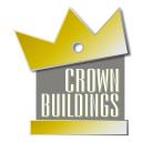
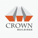
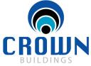
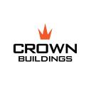
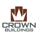
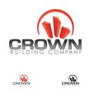
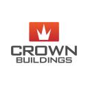
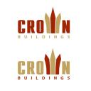
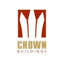
logo design for Crown Buildings company
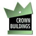
logo design for construction company
Contest Holder
Category
Logo Design
Contest Type
Public
Prize
500.00
Contest Start
July 30, 2008
Contest Length
12 days
Payments Method
Credit Card
Requested File Formats
Standard Web Formats (.jpg, .gif or .png)
Print Ready Vector Formats (.eps, .pdf or .ai)
Print Ready Vector Formats (.eps, .pdf or .ai)
Contest Tagline
logo design for construction company
Contest Summary
logo design for construction company
Contest Description
I'm not sure what I want. I have been trying to find a logo for months with no success. All I get is cheesy logos that I could draw in ms paint. I just want something that will look great on signs, trucks, t-shirts, hats, etc... Something clean and modern. I do not want all the obvious clip art that goes with construction. I am building what I hope will be a very large corporation, and I want a logo that will stand the test of time and be very recognizable. I want something young, hip, and modern. I am a 32 year general contractor and currently building over $7 million worth of projects and need this logo to show me and what I've done.
Entries
-

-
 Unrated
 -
-
 Unrated
 -
 Unrated
 -
 Unrated
 -
 Unrated
 -
 Unrated
 -
 Unrated
 -
 Unrated
 -
 Unrated
 -
 Unrated
 -
 Unrated
 -
 Unrated
 -
-
 Unrated
 -
 Unrated
 -
 Unrated
 -
 Unrated
 -
 Unrated
 -
 Unrated
 -
 Unrated
 -
-
 Unrated
 -
 Unrated
 -
 Unrated
 -
 Unrated
 -
 Unrated
 -
 Unrated
 -
 Unrated
 -
 Unrated
 -
-
 Unrated
 -
 Unrated
 -
 Unrated
 -
 Unrated
 -
 Unrated
 -
 Unrated
 -
-
 Unrated
 -
 Unrated
 -
 Unrated
 -
 Unrated
 -
 Unrated
 -
 Unrated
 -
 Unrated
 -
 Unrated
 -
 Unrated
 -

-

-
 Unrated
 -
 Unrated
 -
 Unrated
 -
 Unrated
 -


Contest Forum
here is my entry. waiting for feedback
Professional Quality Designs
My entry: A connection between C & B, a "solid construction" between those two letters.
Website, Graphic and Animation Creation
Another try; a solid icon, representing an open door.
Graphic Design and Prepress Studio
please find attached; my logo suggest development, real estate, construction and a solid reputation
Hi nwwvsltns, I really like the orange logo. Can you give me some more originals with this logo in mind?
Freight Transportation and Logistics Company
Hi TheBigFish, I don't like the 3d treatment, and I think the crown is too traditional, I don't want a "king" crown, maybe you could try something more abtract?
Freight Transportation and Logistics Company
Hi LitmusStudio, your logo is too corporate, and too familiar to me.
Freight Transportation and Logistics Company
Hi Daimeydum,
your idea is very interesting, but the icon looks more like a fence, not a crown. Coud you try another version?
your idea is very interesting, but the icon looks more like a fence, not a crown. Coud you try another version?
Freight Transportation and Logistics Company
can we re-post updated versions of our logos?
Graphic3.net | Professional & Creative Logo Designs
of course you can repost updated versions of your entries.
Freight Transportation and Logistics Company
graphic3, I don't like your 3d treatment. I lneed something unique that says "I am the king in this field".
Freight Transportation and Logistics Company
alright bud, i'll re-create - only reason i did the 3d effect was a lot of modern designs implement that style these days
but i think just a flat unique shape would hold up longer
thanks
but i think just a flat unique shape would hold up longer
thanks
Graphic3.net | Professional & Creative Logo Designs
Hi cgrein,
you used very well all the elements C, B, and Crown, but I am looking for a more sophisticated and modern look.
you used very well all the elements C, B, and Crown, but I am looking for a more sophisticated and modern look.
Freight Transportation and Logistics Company
Hi graphic3,
I agree with you, but I am looking for an icon similar to Rockefeller Center, New York. That icon is modern, sophisticated but not 3d
I agree with you, but I am looking for an icon similar to Rockefeller Center, New York. That icon is modern, sophisticated but not 3d
Freight Transportation and Logistics Company
Hi Daimeydum,
sorry, but as I said before, I like the design, but it still looks like a fence to me.
sorry, but as I said before, I like the design, but it still looks like a fence to me.
Freight Transportation and Logistics Company
Here are 2 of designs out of approx 20 variations I have done would appreciate any feedback. Thanks
I am presenting what I believe to be a solid, clean, and professional logo. While the logo loosely represents a crown, I chose dark blue instead of yellow, as it is a much stronger color.
Hi cgrein,
I don't like your last entry.
I don't like your last entry.
Freight Transportation and Logistics Company
Does this site offer feedback and star ratings to every design or just selectively? Please advise.
My entry: the crown also buildings.
Zipo Design
Comments welcomed from all on my entry.
LEP
Hi rdioogo, I like the green logo, but I am not sure if isn't too complicated. I'm not sure how it would look on the top of buildings.
Freight Transportation and Logistics Company
Hi shelleyfriedrich,
you have an interesting approach, but I don't like the crown you used. I want something more elegant.
you have an interesting approach, but I don't like the crown you used. I want something more elegant.
Freight Transportation and Logistics Company
Hi inspirecreative, I really don't like the crown you used.
Freight Transportation and Logistics Company
Hi LiddyDesigns, I like your idea, but I don't like the way it looks your logo.
Freight Transportation and Logistics Company
Hi ZariaZl, I like your logo. Can I see more variations?
Freight Transportation and Logistics Company
Hi monkeydesigns4u,
I said I love Rockefeller Center logo, and I don't see how your logo could be compared with it
I said I love Rockefeller Center logo, and I don't see how your logo could be compared with it
Freight Transportation and Logistics Company
Hi graphic3,
your logo seems to represent a mosque, and I don't want that :)
your logo seems to represent a mosque, and I don't want that :)
Freight Transportation and Logistics Company
Hi Daimeydum,
I don't see any improvement. you should work on this ideea, not sendinng practically the same logo
I don't see any improvement. you should work on this ideea, not sendinng practically the same logo
Freight Transportation and Logistics Company
Hi hungary333,
nice logo, but not suitable for a construction company.
nice logo, but not suitable for a construction company.
Freight Transportation and Logistics Company
Hi Zipdesign,
your first entry is not bad, but the buildings looks more like people (not crown) to me.
your first entry is not bad, but the buildings looks more like people (not crown) to me.
Freight Transportation and Logistics Company
Hi nubbles and cgrein,
you had the same ideea :) it looks good especailly the 3d treatment. I would like to see more originals with this logo in mind.
you had the same ideea :) it looks good especailly the 3d treatment. I would like to see more originals with this logo in mind.
Freight Transportation and Logistics Company
Hi maromed,
interesting ideea... you should work on it (now is too complicated and is hard to see the letters)
interesting ideea... you should work on it (now is too complicated and is hard to see the letters)
Freight Transportation and Logistics Company
Hi machus4u
I really don't know what represents your logo ...
I really don't know what represents your logo ...
Freight Transportation and Logistics Company
Hi LDesign,
your design it's ok, but a really need a logo that could make the difference...
your design it's ok, but a really need a logo that could make the difference...
Freight Transportation and Logistics Company
Any pointers on the "difference" would be helpful. Typically, designers begin with a lot more information than what is provided above. I would be happy to continue working on this for you, I know that I will produce something you will want to use.
LEP
Hi nwwvsltns,
I like your orange logo and I've asked you for some revisions. When do you think I can get them?
I like your orange logo and I've asked you for some revisions. When do you think I can get them?
Freight Transportation and Logistics Company
I dont have any feedback from ebetience referrencing Rockefeller Center so does anyone know what he is talking about above (in post to me)? I thought the idea of crowdsourcing was getting the benefit of multiple designers and their individual perspectives. I've done this for a very long time and have never had anyone be so rude to me - is this normal on this site?
I am new to this site, but have been doing this for quite some time. We really are going at this blind, ebetiene may tell us they do not like our designs but offers very little information about where to head. As for the Rock Center, the sculpture outside, the sculpture above teh front door. Not sure what logo you are referring to. There are many good designers here and some great stuff, not really sure what we all are to do.
LEP
I think the site needs to have an input box for the contest holder to provide a company description and it's services provided -
Graphic3.net | Professional & Creative Logo Designs
Hi ebetiene,
please find attached the revisiomns you asked for.
please find attached the revisiomns you asked for.
7 years of experience in Graphics Design and Web Development fields
I am sorry but what happened with the deadline?
Hi ebetiene: any feedback is appreciated. Thank you
Zipo Design
Hi LDesign, what I wanted to say is that I am looking for an unique and memorable logo that can be easily recognized.
Freight Transportation and Logistics Company
Hi monkeydesigns4u,
I didn't want to be rude, I've just give you an exemple of the logo I like. As I said in my earlier comment, I am looking for a modern, sophisticated, strong and easy recognizable logo.
I didn't want to be rude, I've just give you an exemple of the logo I like. As I said in my earlier comment, I am looking for a modern, sophisticated, strong and easy recognizable logo.
Freight Transportation and Logistics Company